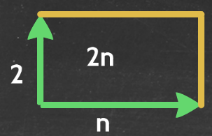
Recently I have been musing over the visualisation of algebra, and have been working with my pupils over viewing algebra as different dimensions. In particular the different visualisations that one can use to interpret algebraic multiplication. For example understanding that 2n can be be visualised like this:
or like this:
A lot of the work has therefore focused on when different visualisations (including 3 dimensions, and understanding if not drawing when we go beyond 3 dimensions) are useful, and when they lead to a more efficient approach for generalising approaches to multiplication. A really poignant example of this has been in expanding and factorising.
One of the first examples we explored was 5(2x + 3), and how this could be viewed like this:
or like this:
With the logic here being that the blue shaded area is the area represented by 5(2x - 4), and that it is the whole area of 5 x 2x (=10x) subtract the 5 x 4 area (=20) and so we have 10x - 20 shaded.
An interesting example to explore was -6(2 - p), and see how to end up with -12 + 6p, for this we looked at this representation:
or like this:
One of the first examples we explored was 5(2x + 3), and how this could be viewed like this:
or like this:
But that the first representation breaks down when expanding something like 2p(7p + 5), because we cannot create "2p" repeats. However the area representation still holds for this:
We were even able to explore how negatives could be handled with this representation, for example 5(2x - 4) being viewed like this:
An interesting example to explore was -6(2 - p), and see how to end up with -12 + 6p, for this we looked at this representation:
by thinking about what the negative of 6(2 - p) would look like (we did consider making the 6 point downwards, and showed that this can work as well as it would lead to -12 - (-6p), but the above was considered a more efficient representation).
What was really interesting was that having thoroughly explored this representation, how quickly the pupils took to factorising. To introduce factorisation all I did was put this image up on the screen and we talked about what would go next to each arrow:
Pupils all pretty much immediately saw the required lengths for the first two. The last one did lead to an interesting discussion about partial factorisation, and so I told the pupils that one of our aims is to maximise the shared height - this quickly led to this height being 3x. Even switching the positives for negatives didn't lead to difficulties as we were used to examining it as the difference of a large area and a smaller area:
I am beginning to think there is a real power in this representation to provide a consistent approach to visualising algebra, provided part of the work we do with pupils is showing them the different ways multiplication can be interpreted (as repeating a shape in the same dimension or extending into the next dimension).
This week I will be tackling the expansion of two binomials and the factorisation of a quadratic into two binomials using a similar approach; I am really looking forward to seeing how that goes.


No comments:
Post a Comment